Add a subtheme using TailwindCSS

Recently I faced a small challenge with TailwindCSS that you may find helpful, and which I didn't get enough information about.
The problem
I was building a NextJS Application that needed a light and a dark theme. I was using TailwindCSS classes to switch styles between one theme and another. As shown in the example below.
function Typography({ text }) {
	return <p className='text-black dark:text-white'>{text}</p>;
}
I needed to set a default theme (light or dark) for each page. But within that page, a component can switch the styles for its subcomponents.

I was using next-themes to set the theme at the _app.tsx level. If the page didn't provide the theme, the default one will be set to dark.
// _app.tsx
import { AppProps } from 'next/app';

export enum ThemeMode {
	LIGHT = 'light',
	DARK = 'dark',
}

function App({ Component, pageProps }: AppProps) {
	return (
		<>
			<Head>
				<title>Web App</title>
			</Head>
		</>
		<ThemeProvider
				attribute='class'
				enableSystem={false}
				forcedTheme={
					(Component as ThemeComponentClass)?.theme || ThemeMode.DARK
				}
			>
			<Component {...pageProps} />
		</ThemeProvider>
	);
}
// pages/myPage.tsx
function Typography({ text }) {
	return <p className='text-black dark:text-white'>{text}</p>;
}

function MyPage() {
	return (
		<main className='p-4 dark:bg-black'>
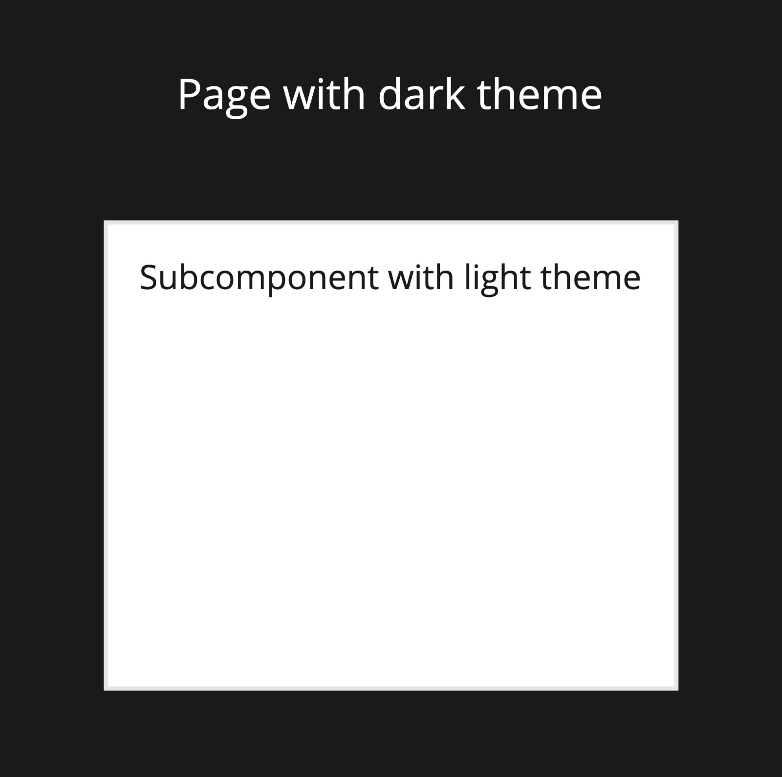
			<Typography>Page with dark theme</Typography>
			<div>
				<div className='bg-white'>
					<Typography>Subcomponent with light theme</Typography>
				</div>
			</div>
		</main>
	);
}

MyPage.theme = ThemeMode.DARK;

export default MyPage;
The problem with this approach is that the Typography in the white container will have a white font, so its styles won't work for the subcomponent with the light theme.
The dark: modifier will apply those styles to the entire page. No matter if you want to switch them for a specific component.
The solution
Tailwind provides a very simple way to add plugins by updating the configuration file. I added the addVariant() helper function for registering custom static variants.
const plugin = require('tailwindcss/plugin');

/** @type {import('tailwindcss').Config} */
module.exports = {
	darkMode: 'class',
	plugins: [
		plugin(function ({ addVariant }) {
			addVariant('theme-light', ['html .theme-light &', '.light &']);
			addVariant('theme-dark', ['html .theme-dark &', '.dark &']);
		}),
	],
};
The addVariant() helper allows you to register your custom modifiers that can be used just like built-in variants like hover, focus, or supports.
Here, are the rules for the variant we added through the plugin.
- theme-light: modifier will match the following CSS selectors: 'html .theme-light &' and '.light &'.
- theme-dark: modifier will match the following CSS selectors: 'html .theme-dark &' and '.dark &'.
Now we can add the modifiers to our previous example.
// pages/myPage.tsx
function Typography({ text }) {
	return (
		<p className='theme-light:text-brand-black theme-dark:text-brand-white'>
			{text}
		</p>
	);
}

function MyPage() {
	return (
		<main className='p-4 theme-dark:bg-black'>
			<Typography>Page with dark theme</Typography>
			<div>
				<div className='theme-light bg-white'>
					<Typography>Subcomponent with light theme</Typography>
				</div>
			</div>
		</main>
	);
}

MyPage.theme = ThemeMode.DARK;

export default MyPage;
The Typography component will automatically adjust the font color based on the container's class for the light and dark themes. Remember to add the theme-light or the theme-dark to the container of the subtheme.
You can play with this example in the Tailwind Playground.
